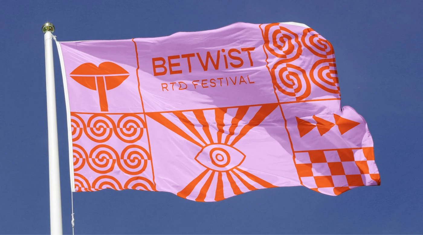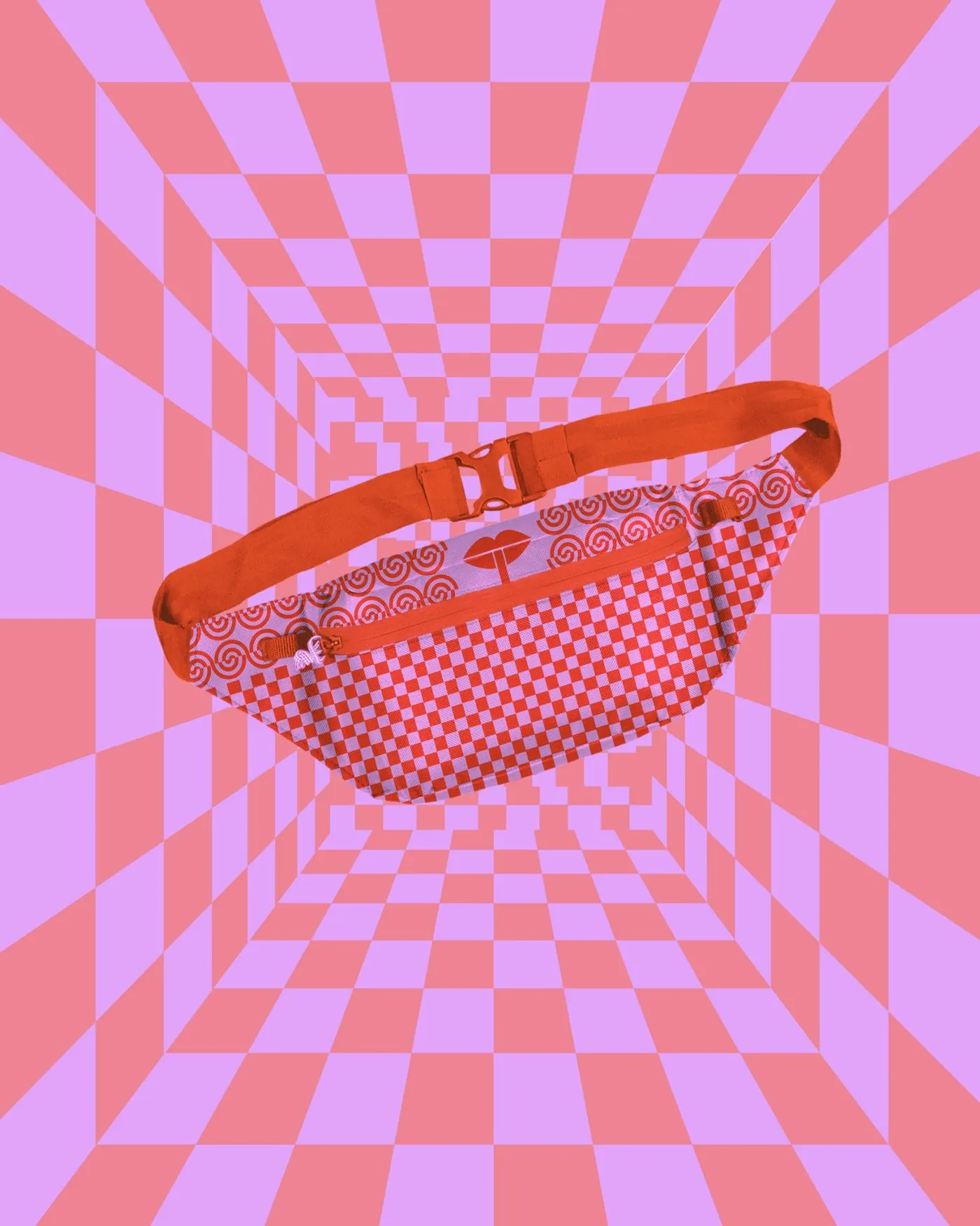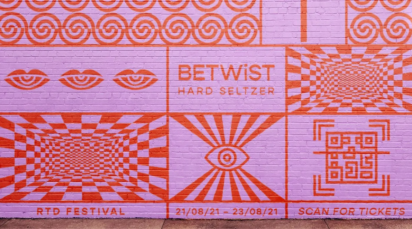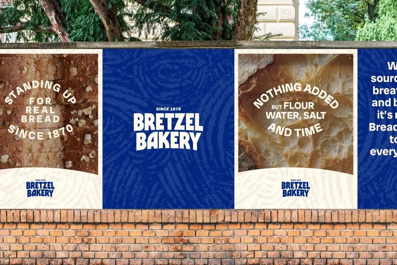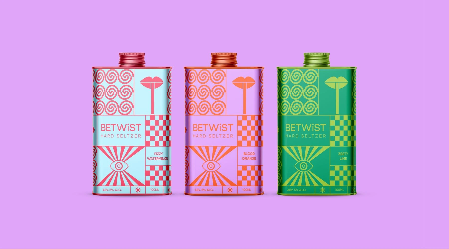
How do you create a brand story and packaging for pre-mixed cocktails that capture the excitement of a festival? By using bold colours, distorted shapes, and disorientating patterns to evoke the exaggerated and wild feeling of being at a festival.
Description
Developed during my design studies at Shillington, the brief was to create a brand story and packaging for a ready-to-drink hard seltzer with a twist. Designed with open-minded, fun-loving festival-goers in mind, the name comes from the word ‘betwixt’, meaning in between two things, alluding to the exaggerated, creative and wild amalgamation of the person you can become at a festival
As an independent designer, I was responsible for the full end-to-end execution of this project. This included the creation of a brand story and packaging where bold colours, distorted shapes, and disorientating patterns capture the excitement, imagination and hallucination experienced at festivals.